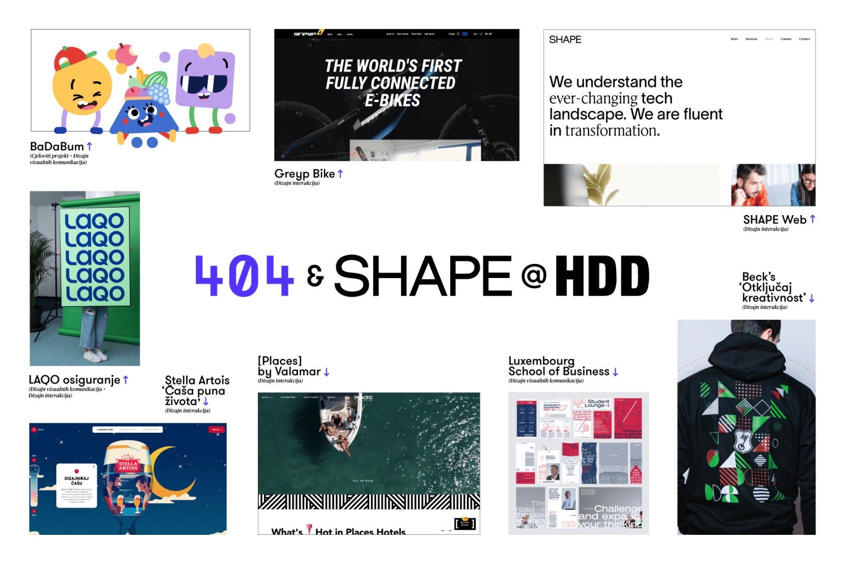
The Croatian Design Association selected 10 projects from 404 and SHAPE to display at the 21/22 Exhibition of Croatian Design at Lauba in Zagreb. The exhibition lasts from January 10 to January 22. All selected work is entered into the competition for the Croatian Designer Association award, the most prestigious design award in the country.
Let’s take a look at the projects displayed this year:
Category: Whole project / product
1. Project: Speech therapy platform – Client: BaDaBum – Agency: 404
Over the course of a multi-year design process, we brought expertise and technology together to create BaDaBum – Croatia’s first platform for children’s speech and language development that helps kids develop their vocabulary, language comprehension, phonology, visual perception, graphomotor skills, concentration, reading motivation, and pre-math skills.
Category: Visual communication design
2. Project: Branding – Client: BaDaBum – Agency: 404
Branding BaDaBum happened in parallel with product development itself. To create a sense of intimate communication and user experience, we created a unique, humanistic sans typeface “BaDaBum,” and 3 brand characters named Ba, Da, and Bum. Formed as basic geometric shapes, the friendly characters cheerfully guide kids through the BaDaBum world.
3. Project: Branding LAQO osiguranje – Client: Croatia osiguranje – Agency: 404
Introducing LAQO: the first 100% digital car insurance. We started from zero and built the whole product pixel by pixel: from naming to complete branding, digital product development, to shaping its communication channels. Throughout the process, we were focused on creating a contemporary communication style with an emphasis on transparency, clarity, and intuitive design.
4. Project: Global Executive MBA visual identity – Client: Luxembourg School of Business – Agency: 404
For its Global Executive MBA program we created a comprehensive new visual identity based on the school’s pre-existing logotype, typography, and color scheme. The original logotype consisted of a wordmark, monogram (“LSB”) and a red line dividing them — all of which inspired our new creative solution. The angled red line is implemented in pictograms and illustrations, its slope and length define both the typographic layout grid and the formatting of printed materials.
Category: Digital media design / design interactions
5. Project: Beck’s “Otključaj kreativnost” – Client: Zagrebačka pivovara – Agency: 404
Art and creativity are the bedrock of the Beck's tradition. So to engage with users and encourage them to unlock their own creativity, we created a microsite and started a prize contest where they were able to design their own Beck’s t-shirts. With an interactive web design we empowered users to step into the role of a designer, and accentuated the experience with art direction and an open communication style.
6. Project: Vlamar [PLACES] app – Client: Valamar – Agency: Shape 404
[PLACES] by Valamar is a hotel holiday concept that brings together Mediterranean summer, ecological sustainability, and modern tech. We poured it all into an intuitive mobile app that gives guests everything they need to live their best holiday life. With its dynamic interface, guests can get customized content and excursion recommendations based on their destination and reservation status, handle booking and payment, track expenses, unlock rooms with their phone, explore hotel features, and more.
7. Project: E-commerce website – Client: Greyp Bikes – Agency: Shape 404
The Greyp Bikes website doubles as a webshop that provides users with all information related to their e-MTB (mountain) and e-SUV (city) bikes. Thanks to an intuitive user experience, greyp.com offers a creative presentation of the bike offering, insurance add-ons, and the purchase process in just a few simple steps.
8. Project: LAQO web i aplikacija — Client: Croatia osiguranje – Shape 404
In keeping up with global trends in usage-based insurance, we created the first 100% digital car insurance – replacing brick-and-mortar branch offices with a website and app. Our focus on transparency, clarity, and intuitiveness drove the product design from day one. Basing our UX decisions on data from real users (with user research and usability testing) and high-tech methods, we treat our users as friends – and provide detailed guidance every step of the way.
9. Project: SHAPE web – Client: Shape 404 – Agency: Shape 404
This is the company website for SHAPE, a member of 404 group. Created as part of a larger rebranding project to position SHAPE on the market, the site presents their services, completed projects, company information, and open positions. The site acts as a showcase of the company's uniqueness, primarily targeting potential employees by communicating what it’s like to work at SHAPE.
10. Project: Stella Artois “Čaša puna života” – Client: Zagrebačka pivovara – Agency: 404
To pay homage to the legendary sayings we won’t ever forget, we collaborated with Stella Artois to create “Caša puna života” – a microsite where users could design their own beer glass imprinted with their favorite famous quotes. With a simple interface, we asked users to pour a little bit of their personalities into their pint glasses. The key element in the creation was an illustration designed by Vedran Klemens that users could add as a unique visual, depending on their interaction.

